Y, O Y?
Hi.
With the Doctor's help, I selected the right green for the superwash Weasley. It is somewhere between Pine and Frog or Moss, and was deemed by the Doctor to be the most "Harry Pottery" of the available greens.
Have now finished the back, so it is about time I got around to swatching. (Haha!)
Seriously, though, I really do need to swatch now.
Because I haven't got a chart for the letter. (We're doing a "Y" rather than an "H.")
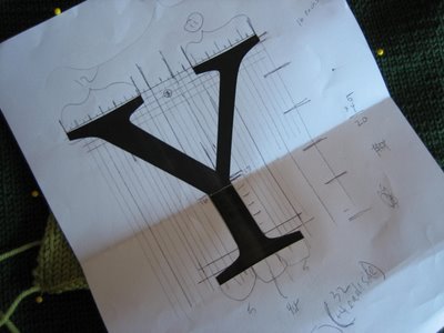
Yes, haven't got a chart. All I've got is this:
 Print out of a super-large letter "Y" in some font or other that looked about right.
The main trouble is this: The letter "H" looks fairly good knitted -- even in the Harry Potter font, it is mainly straight lines, vertical and horizontal. So it works with the boxy grid of stitches you get in stockinette. The lines of the letter are all smooth.
The "Y," though, presents issues: two diagonal lines. So, if you do normal intarsia or duplicate stitch (we're aiming for intarsia over here), you get what we'd call in another context visible pixelation. In other words, those diagonal lines are jagged.
If working in a smaller gauge or fuzzier yarn (even a slightly smaller gauge and slightly fuzzier yarn, like I would be if using that dratted not-really-machine-washable Felted Tweed), probably this would be not-too-noticeable. And I could backstitch around the letter's edges to smooth it all out at the end, if necessary.
But superwash is unforgiving in this vein. The gauge is fairly large, the stitches are very defined (who ever imagines that will be a problem?), and I'm not sure but I think that backstitching would add an awful lot of bulk.
So, I'm swatching to find the best solution.
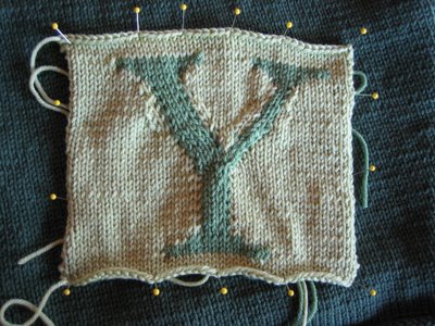
Here's my first shot, made from the other shades of green the Doctor rejected:
 Lumpy!
In this attempt, I've tried decreasing and increasing in the background color, adjacent to the lines of the letter, to form the diagonals. Tried many different styles of increasing and decreasing. It does block out better than it looks here, it does get me straight-edged diagonals, and it does have a certain "Mrs. Weasley" charm to it.
But I think it can be improved.
I'm going to try one more version in this style, then probably try the "normal" intarsia with backstitching. The increasing and decreasing produces distortions in the shape of the fabric, so I figure I ought to at least *try* the "obvious" solution.
TTFN
With the Doctor's help, I selected the right green for the superwash Weasley. It is somewhere between Pine and Frog or Moss, and was deemed by the Doctor to be the most "Harry Pottery" of the available greens.
Have now finished the back, so it is about time I got around to swatching. (Haha!)
Seriously, though, I really do need to swatch now.
Because I haven't got a chart for the letter. (We're doing a "Y" rather than an "H.")
Yes, haven't got a chart. All I've got is this:
 Print out of a super-large letter "Y" in some font or other that looked about right.
The main trouble is this: The letter "H" looks fairly good knitted -- even in the Harry Potter font, it is mainly straight lines, vertical and horizontal. So it works with the boxy grid of stitches you get in stockinette. The lines of the letter are all smooth.
The "Y," though, presents issues: two diagonal lines. So, if you do normal intarsia or duplicate stitch (we're aiming for intarsia over here), you get what we'd call in another context visible pixelation. In other words, those diagonal lines are jagged.
If working in a smaller gauge or fuzzier yarn (even a slightly smaller gauge and slightly fuzzier yarn, like I would be if using that dratted not-really-machine-washable Felted Tweed), probably this would be not-too-noticeable. And I could backstitch around the letter's edges to smooth it all out at the end, if necessary.
But superwash is unforgiving in this vein. The gauge is fairly large, the stitches are very defined (who ever imagines that will be a problem?), and I'm not sure but I think that backstitching would add an awful lot of bulk.
So, I'm swatching to find the best solution.
Here's my first shot, made from the other shades of green the Doctor rejected:
 Lumpy!
In this attempt, I've tried decreasing and increasing in the background color, adjacent to the lines of the letter, to form the diagonals. Tried many different styles of increasing and decreasing. It does block out better than it looks here, it does get me straight-edged diagonals, and it does have a certain "Mrs. Weasley" charm to it.
But I think it can be improved.
I'm going to try one more version in this style, then probably try the "normal" intarsia with backstitching. The increasing and decreasing produces distortions in the shape of the fabric, so I figure I ought to at least *try* the "obvious" solution.
TTFN
Labels: Green Weasley

1 Comments:
Very clever idea, but you are right, too lumpy. I know that I have heard that with intarsia, the more detailed the design, the more stitches per inch.(smaller gauge)or larger the project should be. I'm sure you are moving in the right direction thinking about the different types of yarn, (ie fuzzy vs. non-fuzzy). Can't wait to see what you decide.
Ang
Post a Comment
<< Home